M4MATCH CASE STUDY
Project Status: Complete
M4MATCH IS A MATCH MAKING APPLICATION
Duration: 6 Months
Project: M4MATCH
Roles & Responsibilities: UX/UI Design/Research
Meet the customer to understand their business requirements, goals and problems. Organize and facilitate customer’s product vision by presentations, researching, conceiving, sketching, low, mid and hi-fidelity wireframes prototyping, usability testing and user-testing. Conduct multiple research methods and run tests to the primary design decisions. Work within the brand guidelines to create the best UX GUI that strengthens the company or speech through its value.
REQUIREMENTS
The customer primary requirements for the application are needed to bring in the market a top most popular dating app by quality and performance. Not only that, it must be allow users to make seriously and safely connections with equal match. Also, needs to be accessible for every user with the best user experience and aesthetic UI design. In connection with the app needs to be used fast and efficient technology, strictly covered and protected the complete privacy of users. Required a master control of the application to monitor and evaluate the graph of the growth and the daily performance.
PROJECT SUMMARY
The m4match.com application allows to meet and connect conveniently with equal minded people. A fully customizable search options allow user to find a perfect match through the app. The m4match.com app platform provides the most reliable privacy protection for users. Users can share their expectations, photos, and life stories for a better start. A full-fledged control panel allows users to manage their profile at any time with the options add, edit, and delete. Each m4match.com profile filtered and validated by multiple layers of security methods. Mainly validations completing through phone numbers, emails and IP address.
Hi-Fidelity Wireframe
TOOLS USED: FIGMA, ADOBE CC, WHITE BOARD
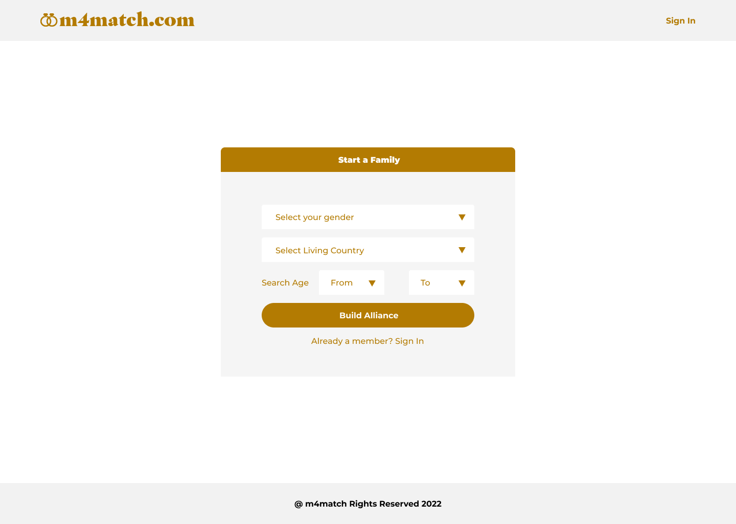
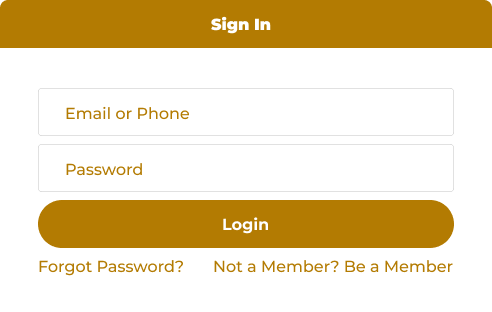
Sign In Page - Option 1
Option 1 submit button with a bottom corner radius
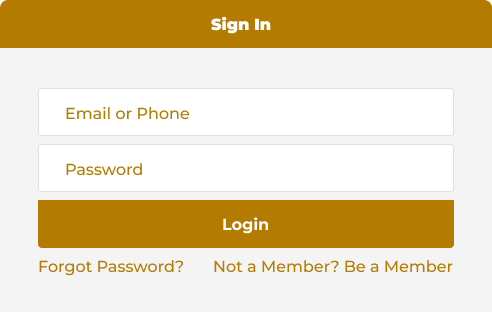
Sign In Page - Option 2
The option two is with a rounded submit button
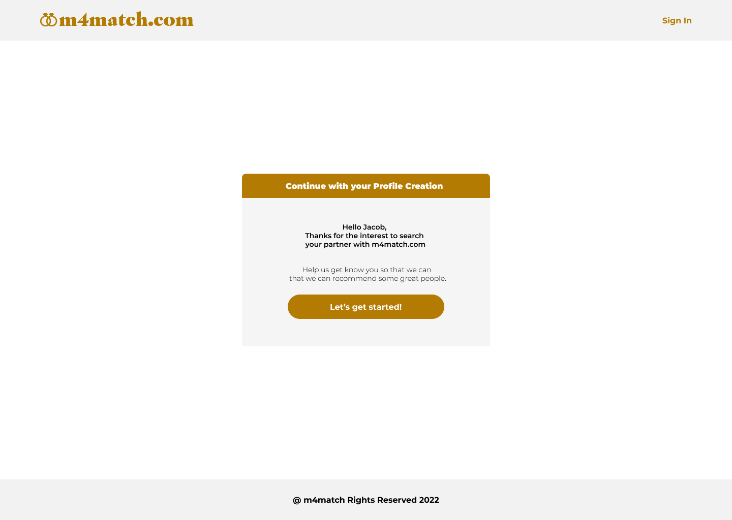
Profile Welcome Page
Welcome page for the profile registration
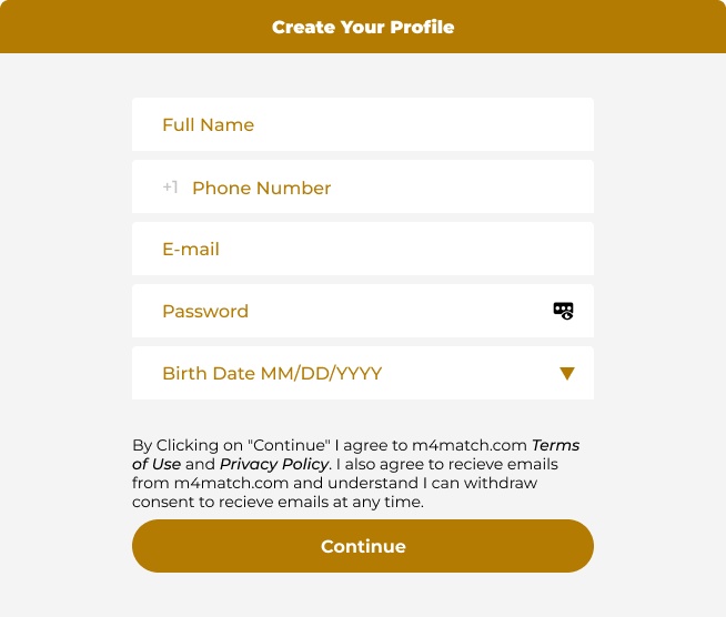
Profile Creation Option 1
Create profile for registration begins
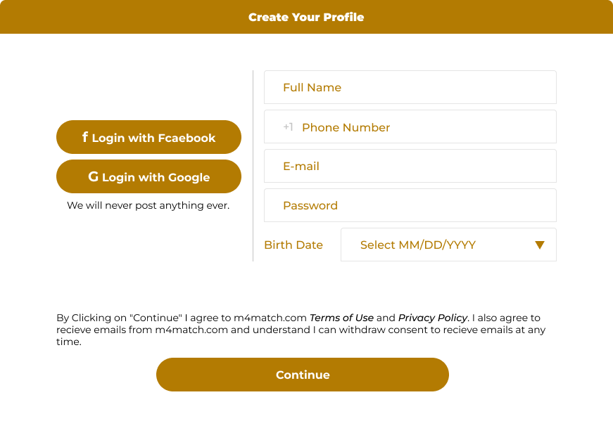
Profile Creation Option 2
Another login option with google and facebook
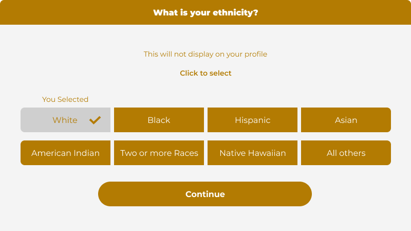
Ethnicity Option 1
Continuation of profile creation, section ethnicity
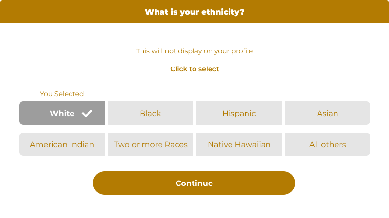
Ethnicity Option 2
Another option for the ethnicity section
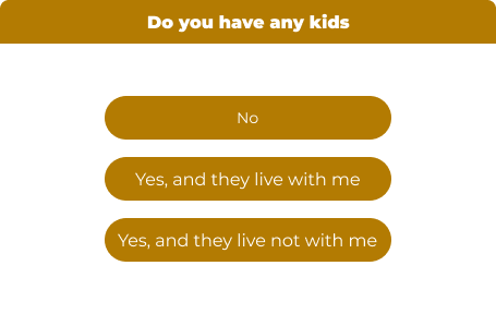
Supporting Datas for the Profile
Family details for the profile
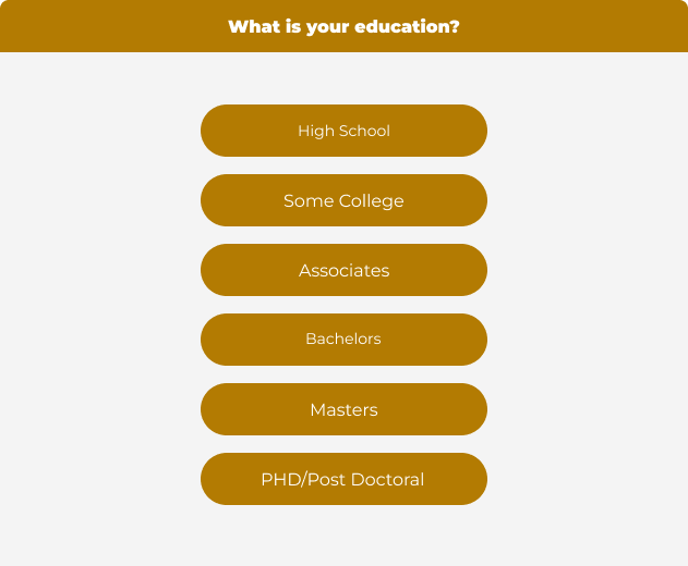
Edu
Education
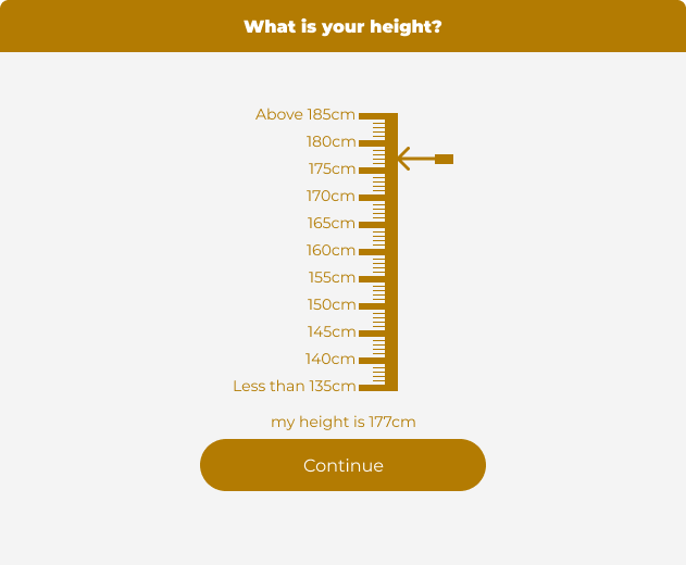
Wireframe - Height
Height Section
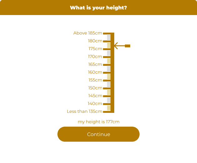
Wireframe - Height Option 2
Wireframe - Height Option 2 white background
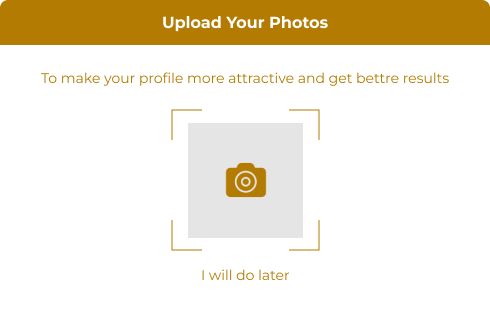
Wireframe - Photo Upload
Photo upload
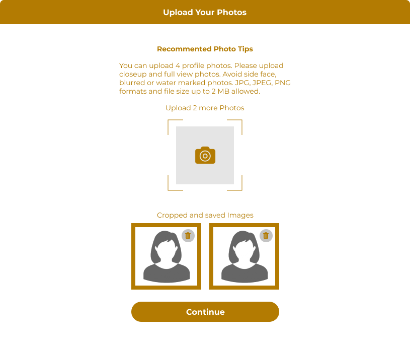
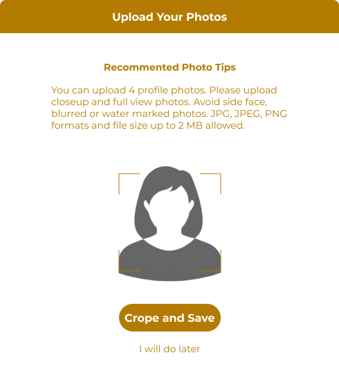
Wireframe - Photo Upload Tips
Photoupload tips: Formats, size, crop and save
Wireframe-Cropped Images
Cropped and save images with option for add more photos
