TICKET PRISM CASE STUDY
Project Status: Complete
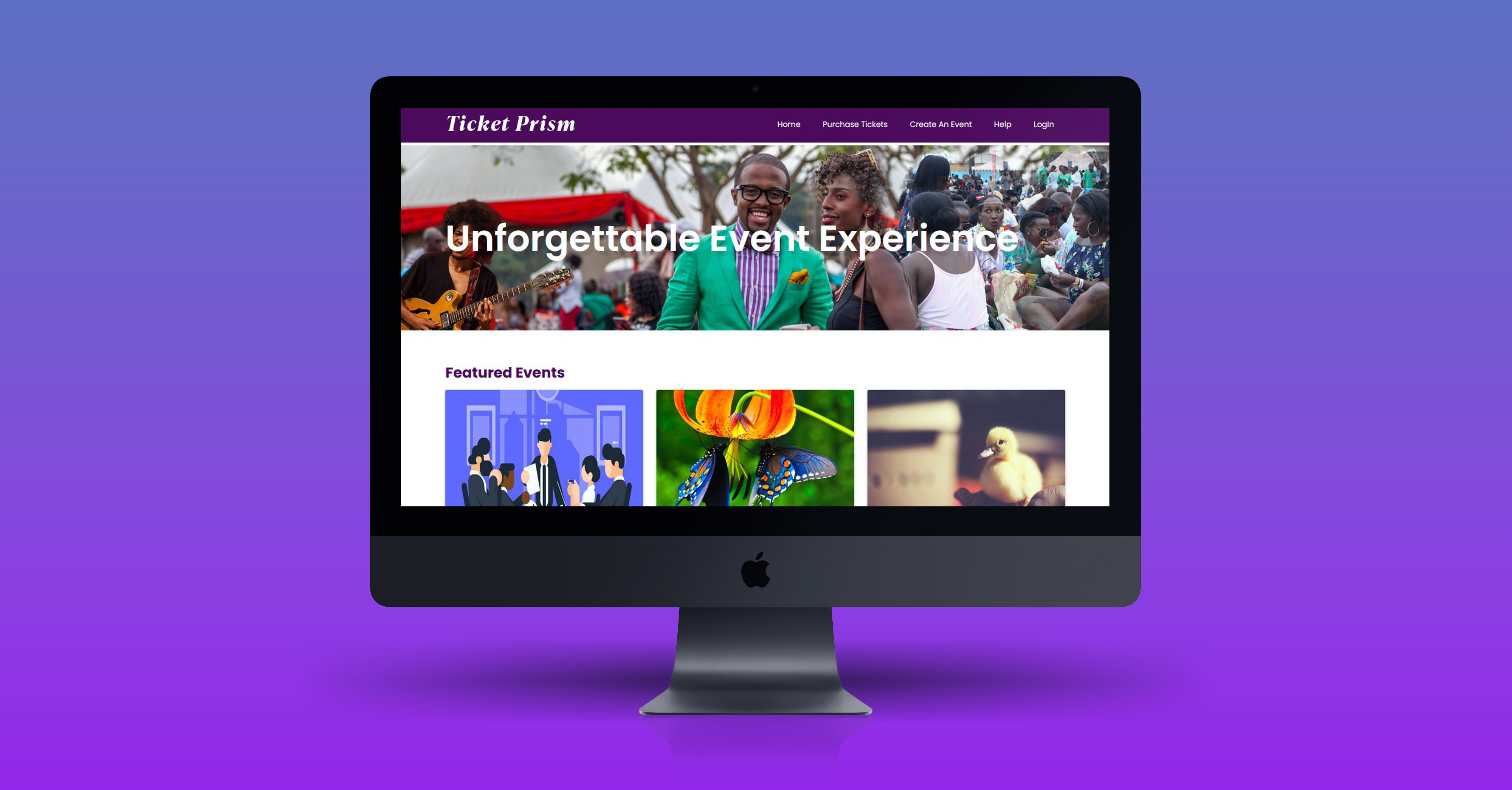
EVENT MANAGEMENT PLATFORM
Project Duration: 7 Months
Project: TICKET PRISM
Roles & Responsibilities: UX Designer
I was responsible initially to gather the requirements and conducting focus groups to understand the market and the limitations of the current event management web applications. Based on these understandings, I came up with the initial sketches and worked with the stakeholders. These sketches were converted into both high and low fidelity wireframes. The responsive design that I had created was very well received by the stakeholders.
Project Summary
The Software: A Easy full service Event Management Solution
Ticket Prism is an end-to-end online event management platform that lets users to find and create events. The application covers registrations and ticketing processes with the entire event management lifecycle. The platform helps to plan events, such as event academies, classes and workshops. The platform also lets users sell tickets, register online, post events, manage events online, event management, register event for paid and free online events.
Requirements
The client came up with the following requirements:
Option to create events by the organizer, ability to validate the organizer with an automated system, organizer needs to manage past, future programs and current events. Ability to create custom payment system and registration for the organizer with the option to add, edit, delete in the organizer controlled admin with a fully functional dashboard. The management side option is a master control of the entire events and application.
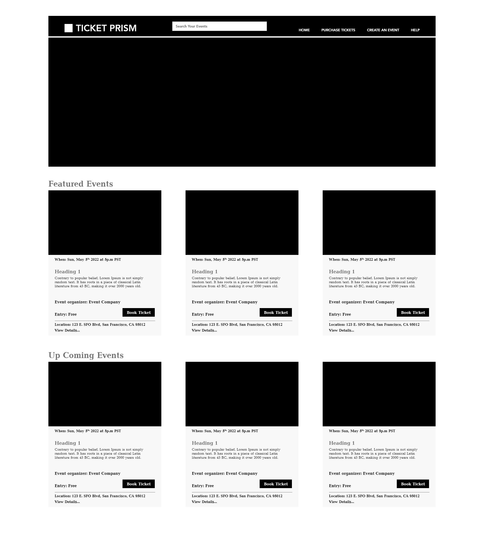
Wireframe Landing Page - Version - A
I did A/B testing for this application, a full service online event management platform. The purpose of this test is to allow users to find which one performs better. I designed the landing page with three columns in a row for the event intro section as a card. It helps users can easily of use and provides the best UX flow in mobile and web with a good responsiveness.
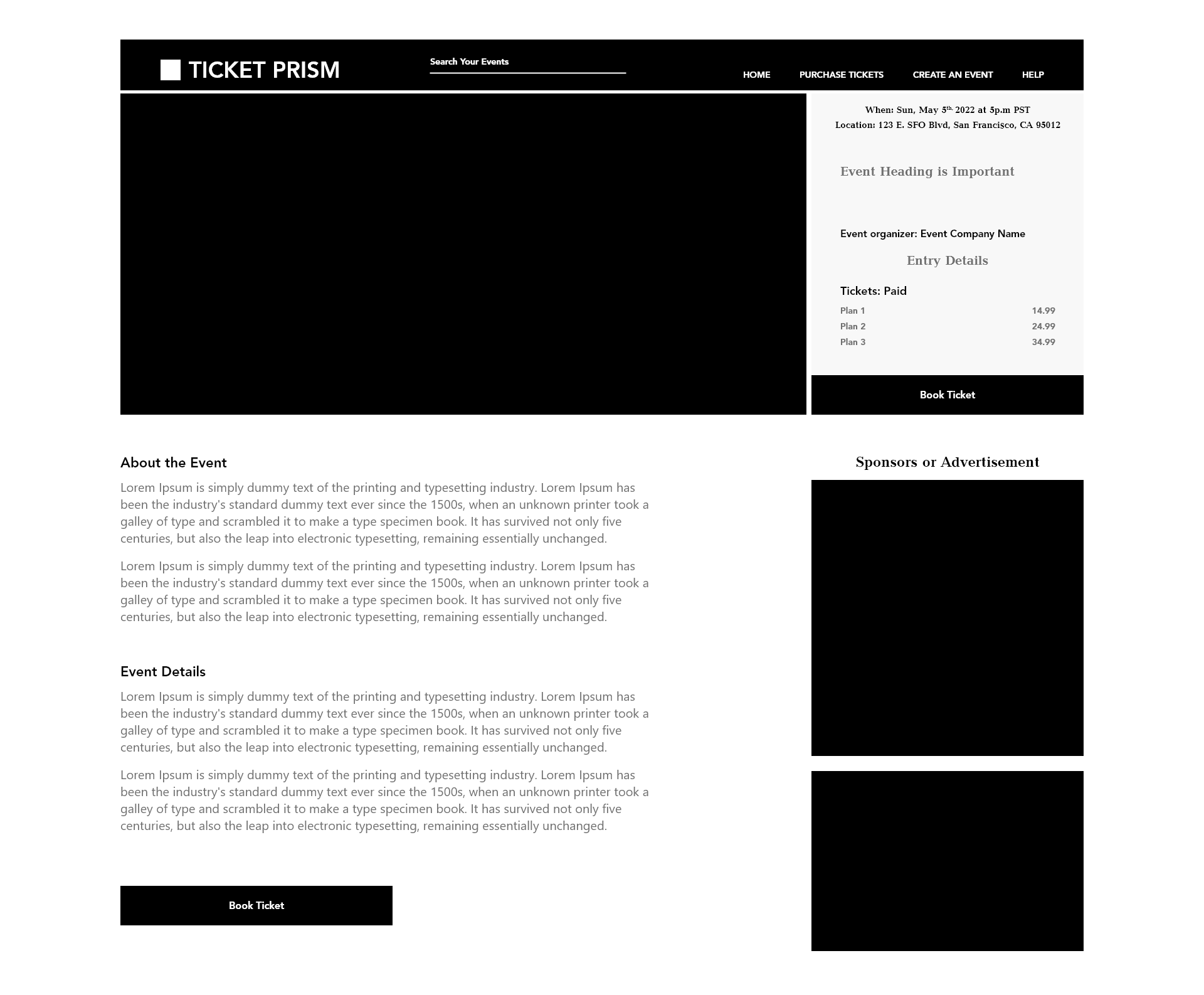
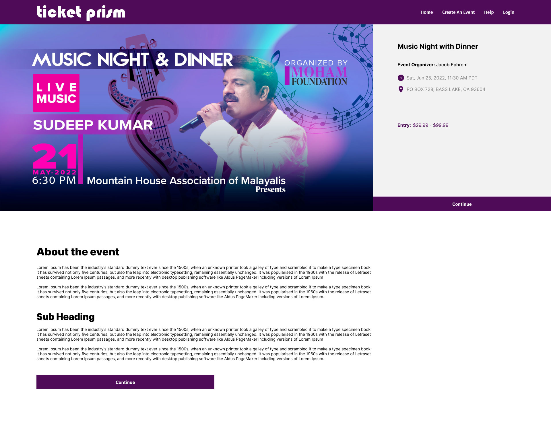
Wireframes - Event Detail Page
This is the detailed page of the event. Users can easily read more contents and images to help the event ticket booking.
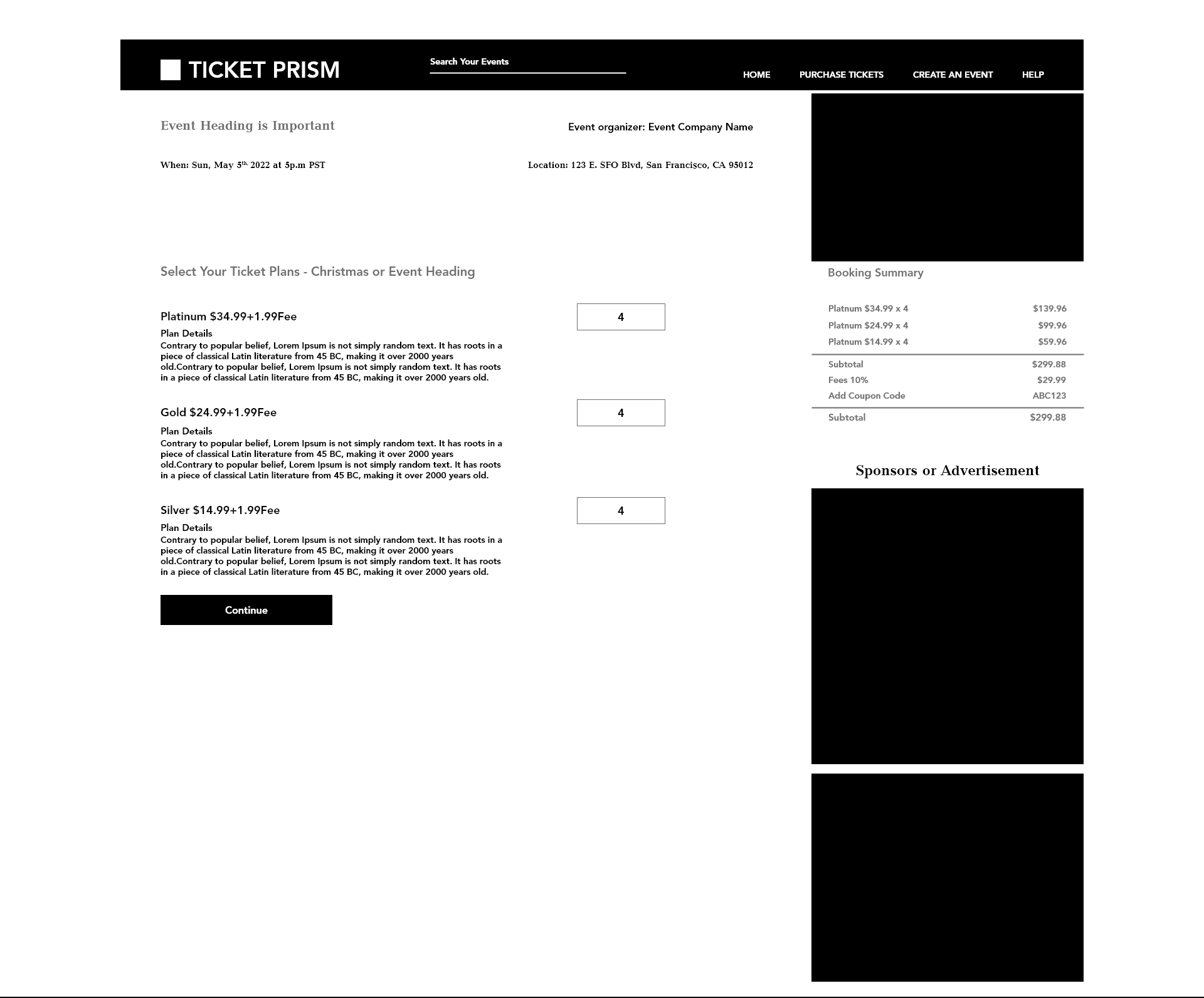
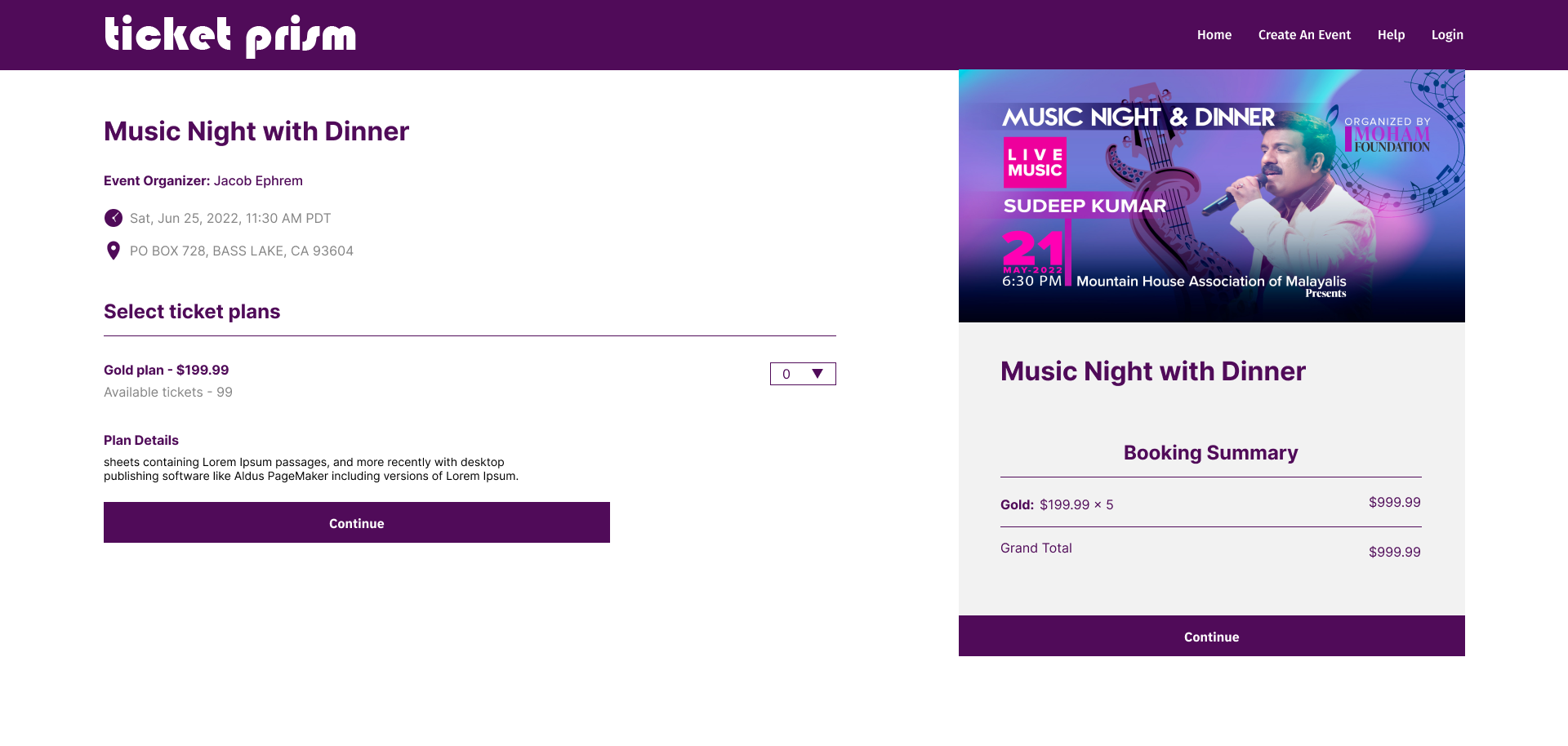
Wireframe - Ticket Booking Page
With this page user can simply select the options for event tickets and registrations. Added plan details and ticket price with the total amount of purchase.
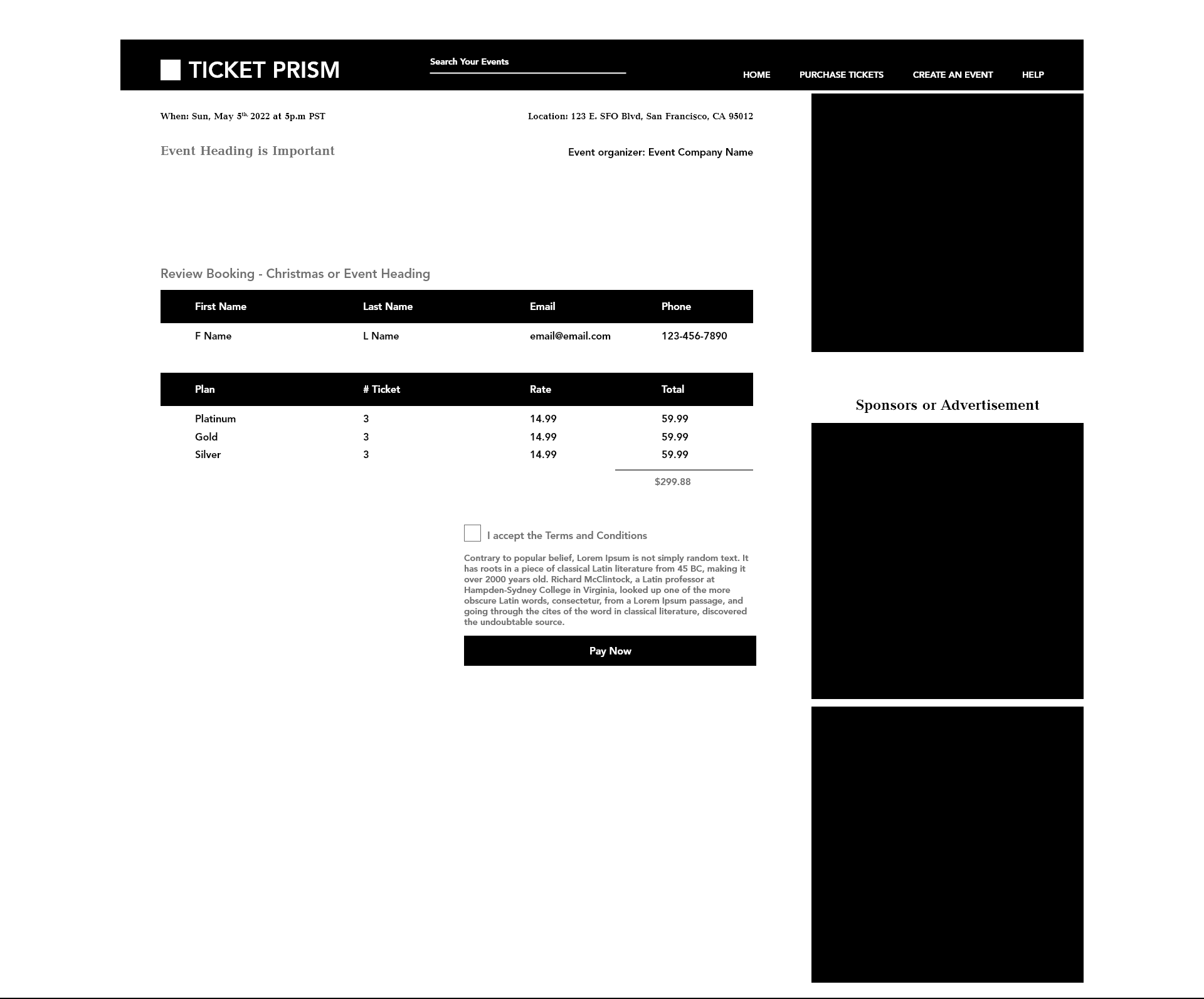
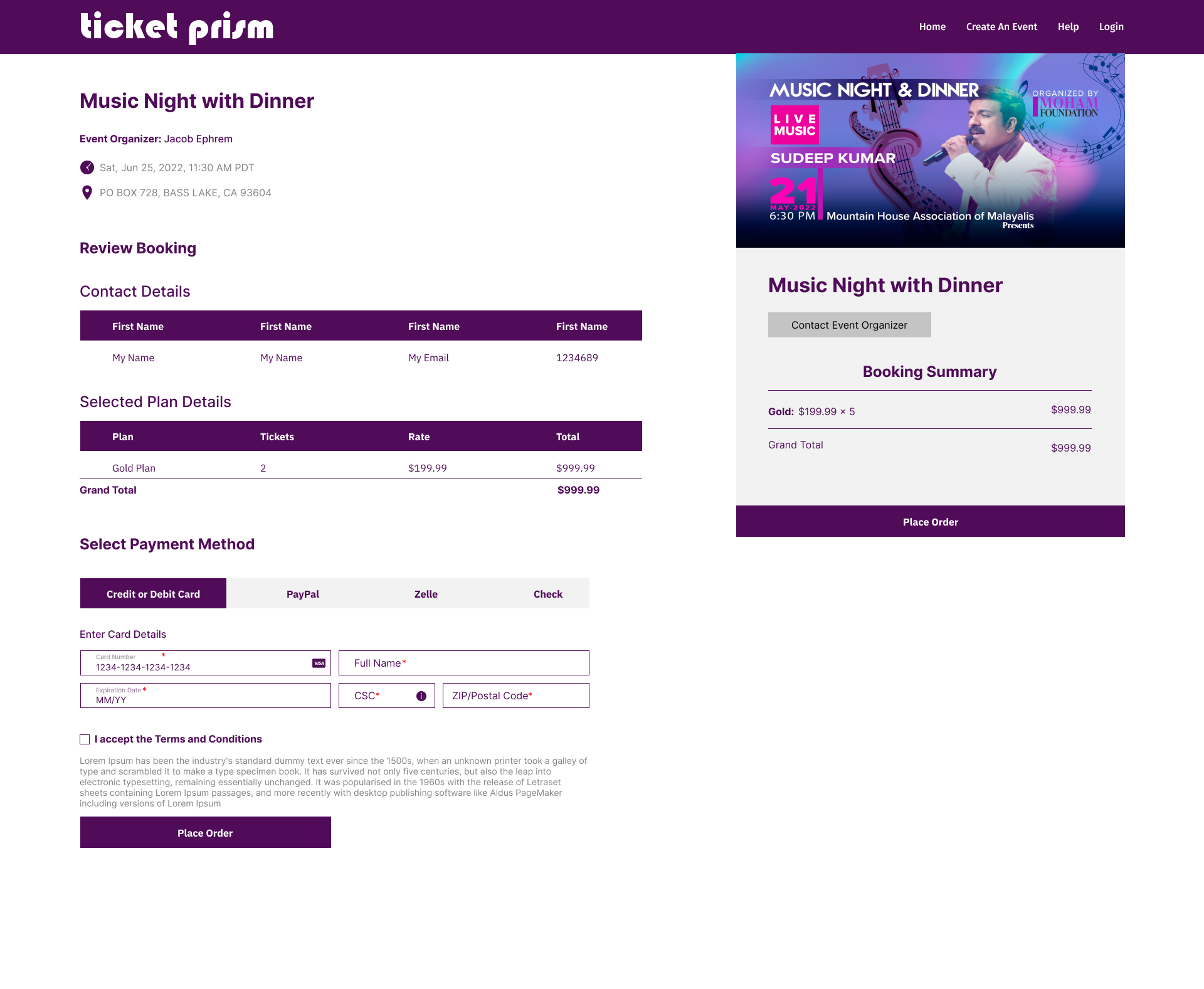
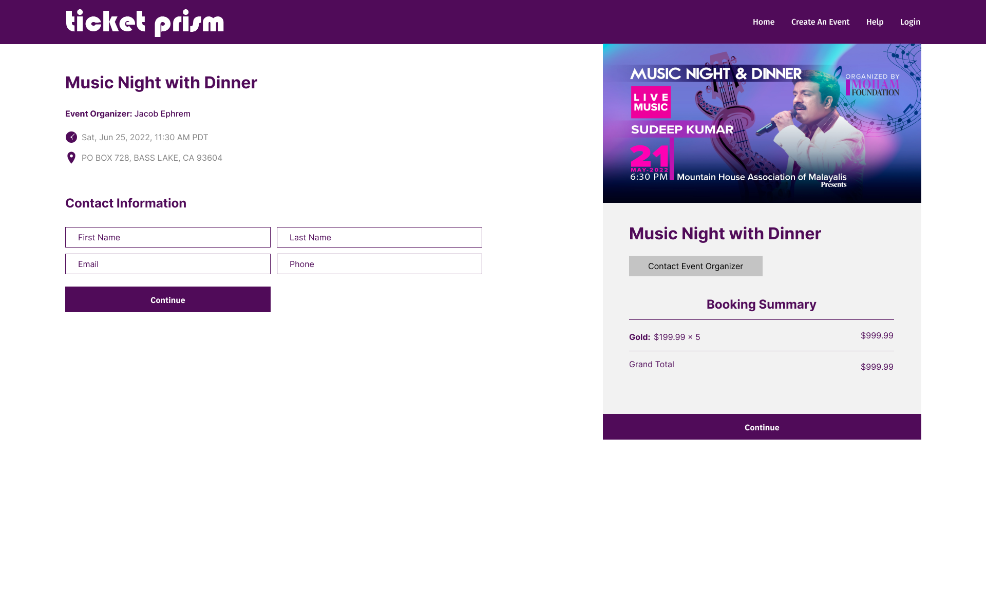
Payment details & Review Section
User can review the selected event ticket. After the review directly can go for the payment to place the order.
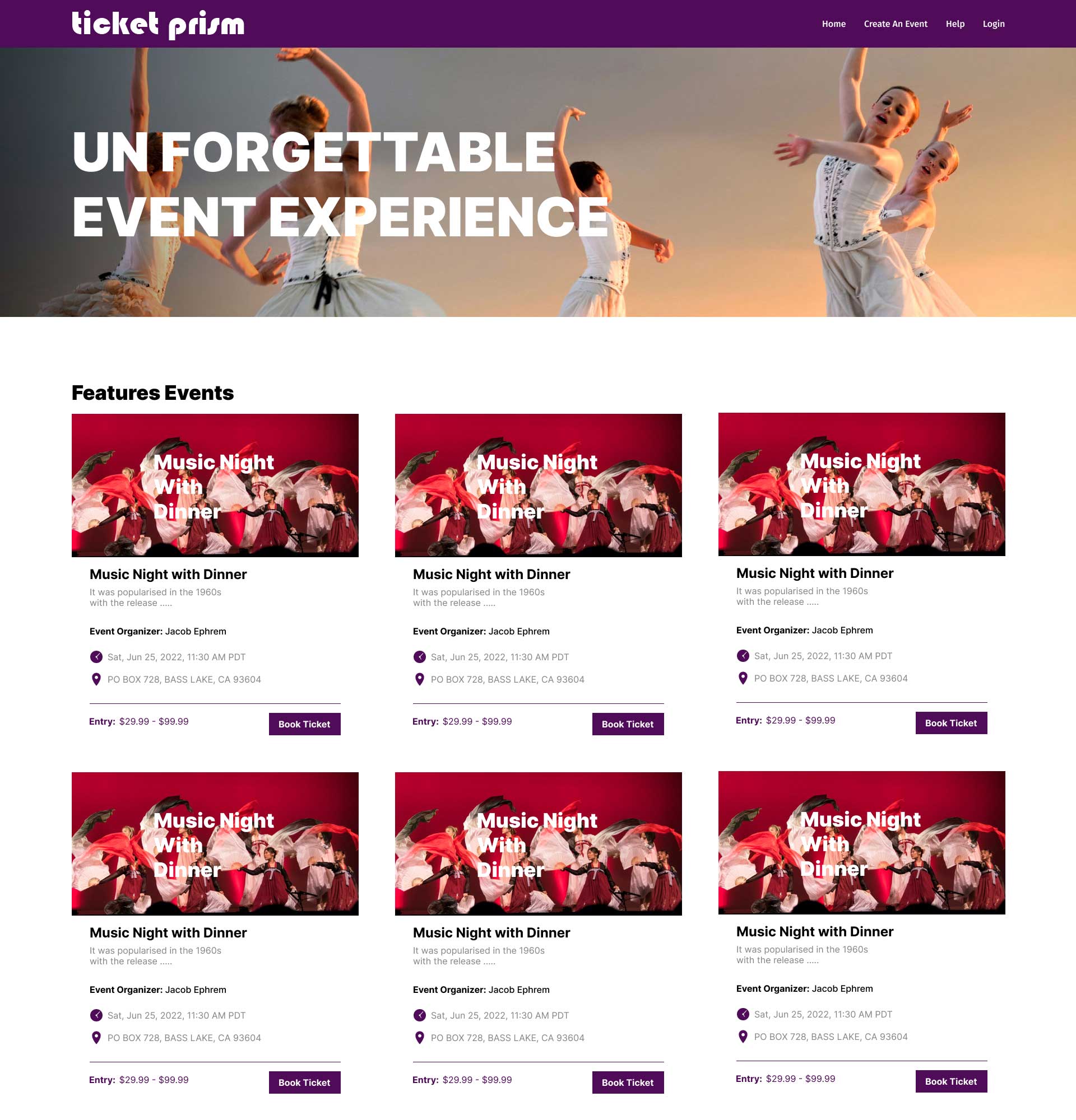
LANDING PAGE -VERSION 'A'
Landing page version 'A' three event cards in a row. The A/B test helped me to find out the real problems it resulted very well by user reviews. I used the quantitative and qualitative research method to understand the real problems between these two A/B test versions. In these two version tests resulted 'A' was low performance and the 'B' scored the better UX performance. The user test and usability differences between the problems counted to the final selection version 'B' is the best and continue with the next level design. Finally, the version B performed very well with the increased good numerical value of traffic.
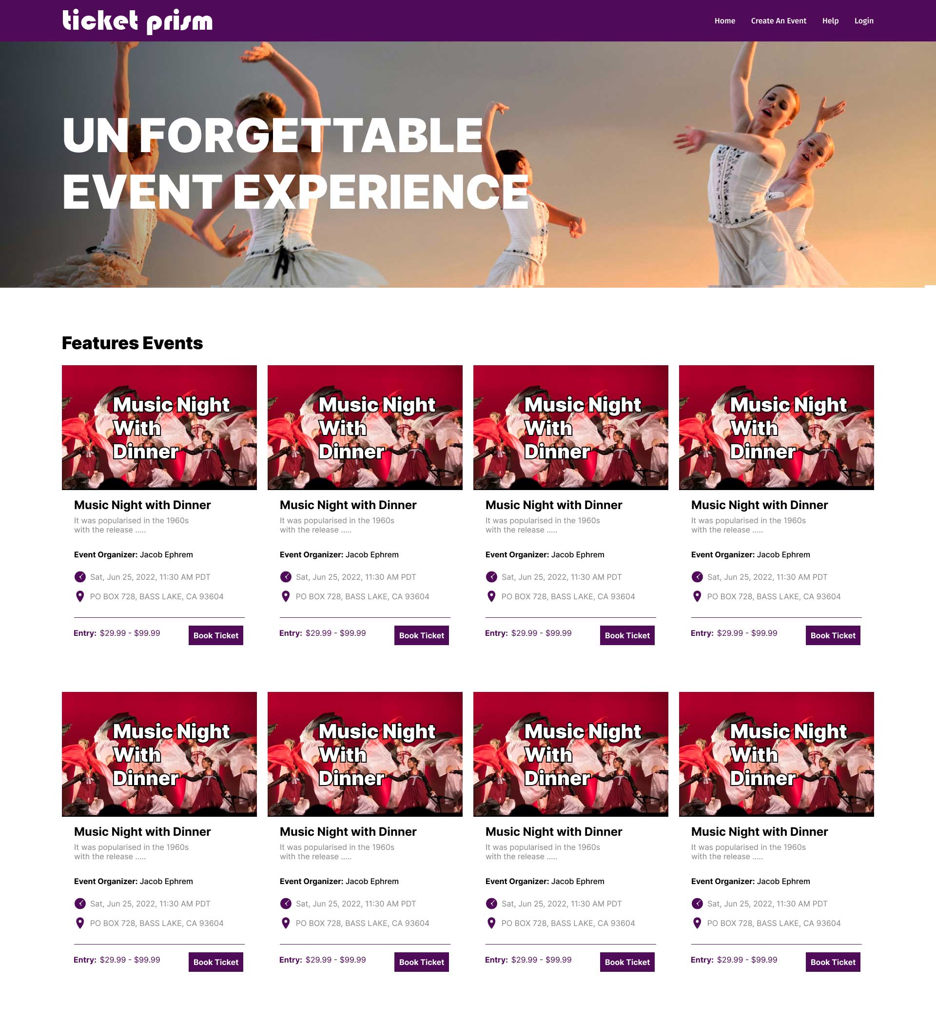
Wireframe Landing Page - Version B
Created the B version for test purpose and it became the most solid productive traffic on website. So, it helped me easily to select the B version for the final. The changes I made for the version B on the landing page used four columns in a row added an advertisement option with the last columns.
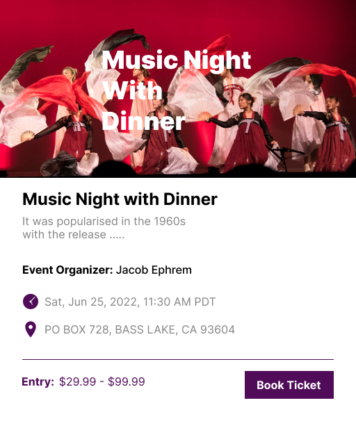
Wireframe - Event Intro Card
Introduction page with little information about the event. It's the thumbnail image and caption with a brief description of the event program. In this card user can see the preliminary details of the event including date, time, event location, and the event organizer details with contact option.
Event Details
Event details with more images and ticket booking.
Ticket selection
Ticket select option and plan details
Contact Details
Contact details with address
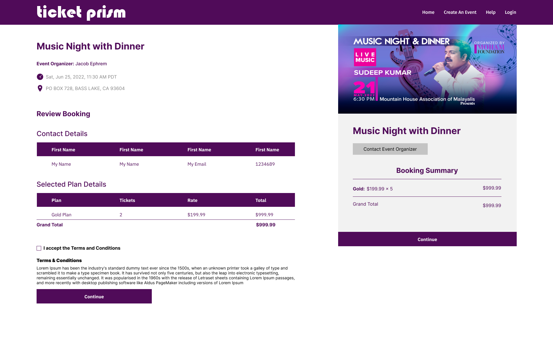
Booking Review
Review booking with details
Select Payment Option & Place Order
Select payment option
