ODIGO QUOTES CASE STUDY
Project Status: Complete
Insurance Quote Management System
Project Duration: 9 Months
Project: ODIGO QUOTES
Roles & Responsibilities: UX Designer/Researcher
Responsible for production of both high and low fidelity wireframes and prototypes. Interacting with the client for use case discussions and conducting the focus groups with multiple personas for arriving at the seamless user interface for the experience of the client interacting with the website. Designing the web application using the latest frontend technologies in association with the team of developers. Was instrumental in deploying the application to the cloud.
Project Summary
Insurance Quote Management System for Odigo, easy to use and streamlined insurance quote management system. Odigo is one of the leading insurance consultancy firms managed by a large group of agents and brokers. The project is to build a very user-friendly insurance quote management system.
The Odigo Quote management system is an integrated portal that manages quotes for home, auto, business and life for individuals. The portal has integrated payment system built in and also has the capability for the renewal of the subscription. Individual agents have the ability to configure their required quota of the leaves (a.k.a quotes) per month in the system. The system has extremely complex workflows to orchestrate all these.
The project resulted in a very user-friendly web application that was used by many insurance agents (users) and by the consumers. The project resulted in rave reviews for its user friendliness and also resulted additional project scope from the company to be developed in the next release of the product.
The Requirements
Ability to generate insurance quote for the consumers through approved insurance agents in the home, auto, business and life industry. Ability for the agents to configure daily caps for the leaves(quotes) based on their business needs. Ability with the integrated payment system. Ability for the subscription management for the quota allocation for the insurance agents.
The existing/current application which was used by the client did not have any of these capabilities and the users were not completing the forms and was losing the customers.
The application caters a B2C2B market where the information collected from the consumers are used by the insurance agents for further business exploration.
When I have started with this project, I was considering the following UX KPIs (Research KPIs - Behavioral and Attitudinal) to be addressed since the company was losing the customers and was having lots of error rate.
Research - Behavioral UX KPI:
The research method KPI is Behavioral and Attitudinal. These research method KPI, Key Performance Indicator helped me to understand the user pain points in the registration. After the user journey, I decided the best problem solution for user registration area in the project.
Task Success Rate: Task success rate (TSR) measures the number of correctly executed tasks and is used very frequently. Although the TSR does not say anything about why a user is not successfully completing a task, it is an initial, very valuable indicator.
Time-on-task: This KPI describes the time (in minutes and seconds) that a user needs to complete a task successfully. The average time-on-task is usually communicated as the final UX KPI. Basically, the shorter the processing time, the better the user experience.
Navigation: Navigation bars represent an important instrument within the website’s ‘orchestra’:
User error rate: The user error rate (UER) is the number of times a user makes a wrong entry. The UER gives you an idea of how clear and user-friendly your website is. The higher the UER score, the higher the number of usability problems. Again, it is important to define in advance which actions represent an error.
Research - Attitudinal UX KPI:
System Usability Scale: The System Usability Scale (SUS) is a ‘quick and dirty’ tool with which you can test the usability of a product. The scale consists of a 10-point questionnaire with five possible answers each, ranging from strongly agree to strongly disagree.
Net Promoter Score (NPS): The Net Promoter Score illustrates customer satisfaction – and loyalty – in one simple metric. Several studies have also confirmed that the NPS is statistically relevant and correlates with a company’s growth.
The user answers this question on a scale of one (very unlikely) to 10 (very likely). The answers are then grouped into three categories, with the ‘passives’ not taken into account in the calculation: Detractors: 0 to 6, Passives: 7 to 8, Promotions: 9 to 10
Customer Satisfaction (CSAT): The CSAT is another attitudinal UX KPI that expresses customer satisfaction in a convenient metric. Users/testers are asked: How satisfied are you with the website? The result is a percentage from 0 to 100, where 100 stands for maximum customer satisfaction. The scale usually includes five rating options, ranging from very dissatisfied to very satisfied. The survey results are then classified and evaluated as follows: Very disatisfied, Dissatisfied, Neutral, Satisfied, Very satisfied
To calculate the CSAT score, only the answers of the satisfied users are counted, i.e. the users who gave ‘satisfied’ or ‘very satisfied’ as an answer.

Persona 1
Haroon Marks
Insurance Agent (Product Subscriber)
Haroon is an experienced agent who’s been in the industry for more than three decades.
Goal: Convert a user into a client as quick as possible.
Frustrations: The previous web applications were having lots of errors and were misleading in collecting the information. He doesn’t like the complex workflows and payment plans that is very common in the current applications in the market.

Persona 2
Margaret Burrows
Insurance Agent (Product Subscriber)
Margaret is a leading insurance agent who has quite a lot of clients. She deals with lots of potential clients who are looking for an ideal insurance in the respective field with better terms.
Goal: Ability to work on a portal effectively with clear objective and directions.
Frustrations: Flexibility in the subscriptions and the monthly cap limit for the leaves were not intuitive in the previous web application.

Persona 3
Manraj Mueller
Student (Consumer)
Manraj is a recent graduate from University of Texas who was looking for an affordable life insurance from a reliable platform.
Goal: Being a Gen Z, he was looking for a user-friendly web interface which will give a reasonable quote for his life insurance needs.
Frustrations: All the insurance quote applications that he was researching were not user friendly and not very intuitive.

Persona 4
Hetty Reyna
Software Engineer (Consumer)
Hetty is working for a software company as a software engineer and was shopping for insurance quote which has an easy-to-use user interface.
Goal: Wanted to have a simple, flawless user interface with a better User Experience and usability.
Frustrations: She already experienced, All the web user interfaces and the workflows Hetty had seen were all very complex.
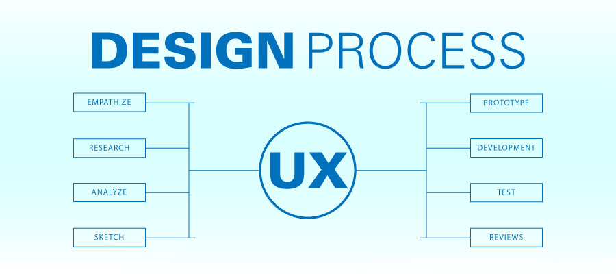
DESIGN PROCESS
Empathize: Before starting any project, understand the basic needs first. It means, the crucial elements user and brand. Find answers all these important questions: What is the user’s pain points? What’s their problem? What issue needs to solve for the user? What problem we need to solve?
Research: As we know the problem, decide the appropriate research method and select persona to solve the problem. The targeted user research will be the key point of product success. I did user interviews, user/focus groups, surveys, and usability testing with user. Used to ask specific inquiry form to collect their attitudes, emotions, and frustrations with an issue or product.
Analyze: Personas: When I got problems in the design solution used to refer back to ask questions what type of design is the best services, he/she the persona need. I went through each area with them in goals, Background, age, gender, behaviors, spending habits, pain points, needs. The user journey maps helped me to find the best solution for the user pain points and problems. It reflected in the final design.
Design: At the time of actual design, followed by the flow of the UX design process started with low-fidelity and hi-fidelity wireframes. The hi-fidelity wireframes represented simple essentials of the product. Also, created the site map, user flow, mockup, images, icons, fonts and colors.
Launch: Completed the user test, as the usability testing with the observance of user/targeted audience and their involvements using the actual product before the Beta version. The limited edition: A limited internal testing version of the product launch for a small number of users with the goal of finding the technical issues and cleaning them up before the final version of the market launch.
Review: After the product launch needs to complete a second-round analysis. Get ready these questions, did the right design process or not? No matter answers wrong or right, learn why? Any struggle points? Learn why? Collect the users responds? Find the answer solve their pain points and problems? How can I improve the product? What lessons can we take away from this process for future products?
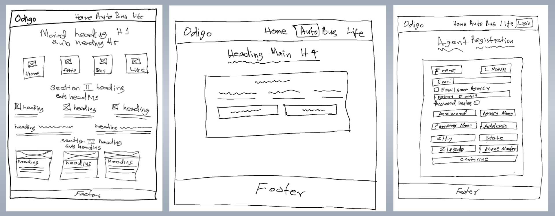
Sketches
Tools used for Sketches: Apple iPad & White Board
Ideas and thought process after the user interviews, put into the white board and came up with these sketches. It helped me to explore competing ideas and designs to move forward. In the early stages of my design process, I explored multiple design ideas simultaneously to identify the right design.
White board was the best option for easy, fast, low-cost, and cost-effective tool for the pre-design ideas to share with users, stakeholders and development teams. Continued thought process, decided the below sketch is the right solution for better usability and user flow.
Tested with users the usability issues, multiple times revised, reviewed the ideas and sketches for the right design decision to ensure it’s an optimal design solution to the problem.
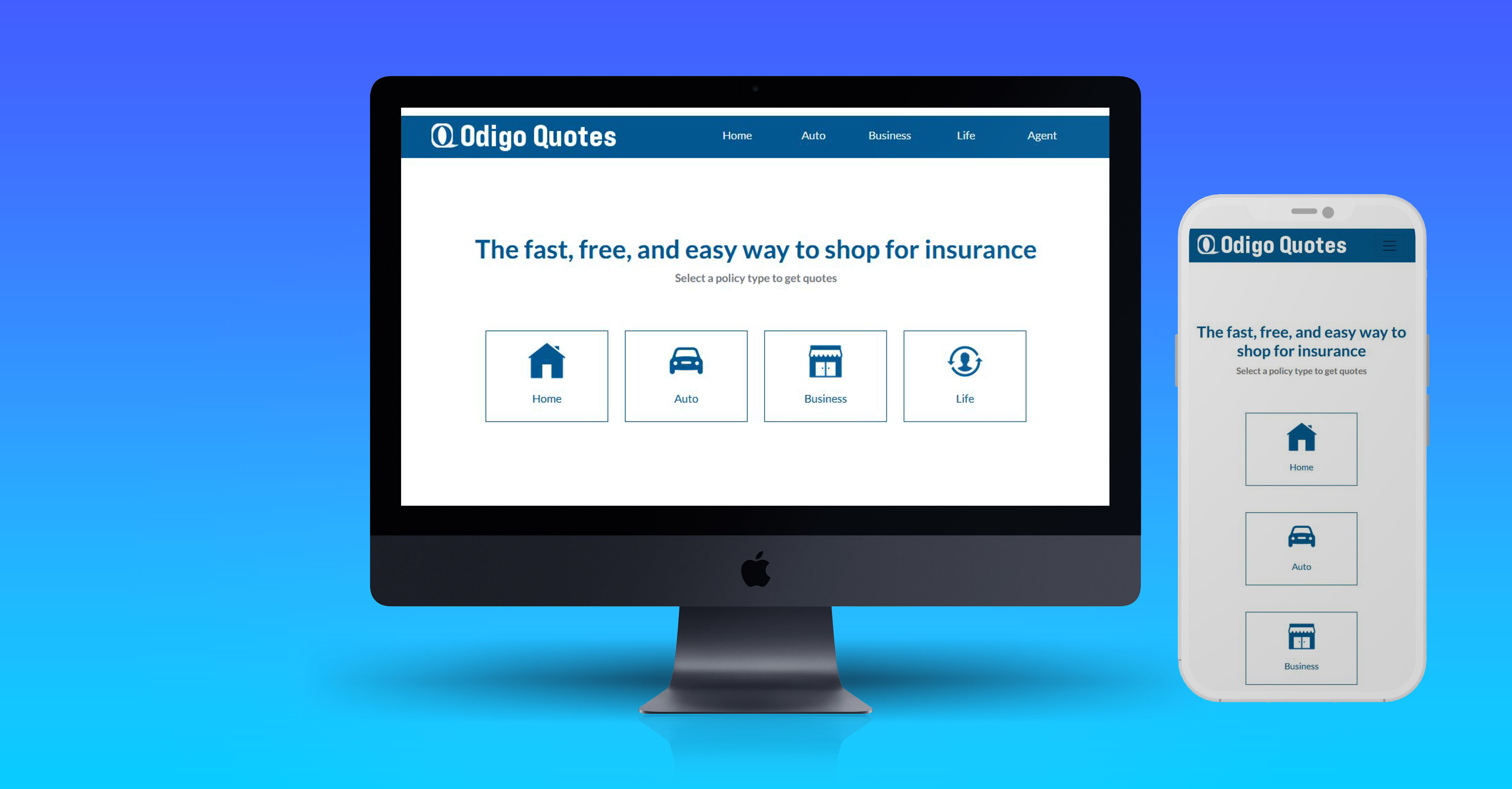
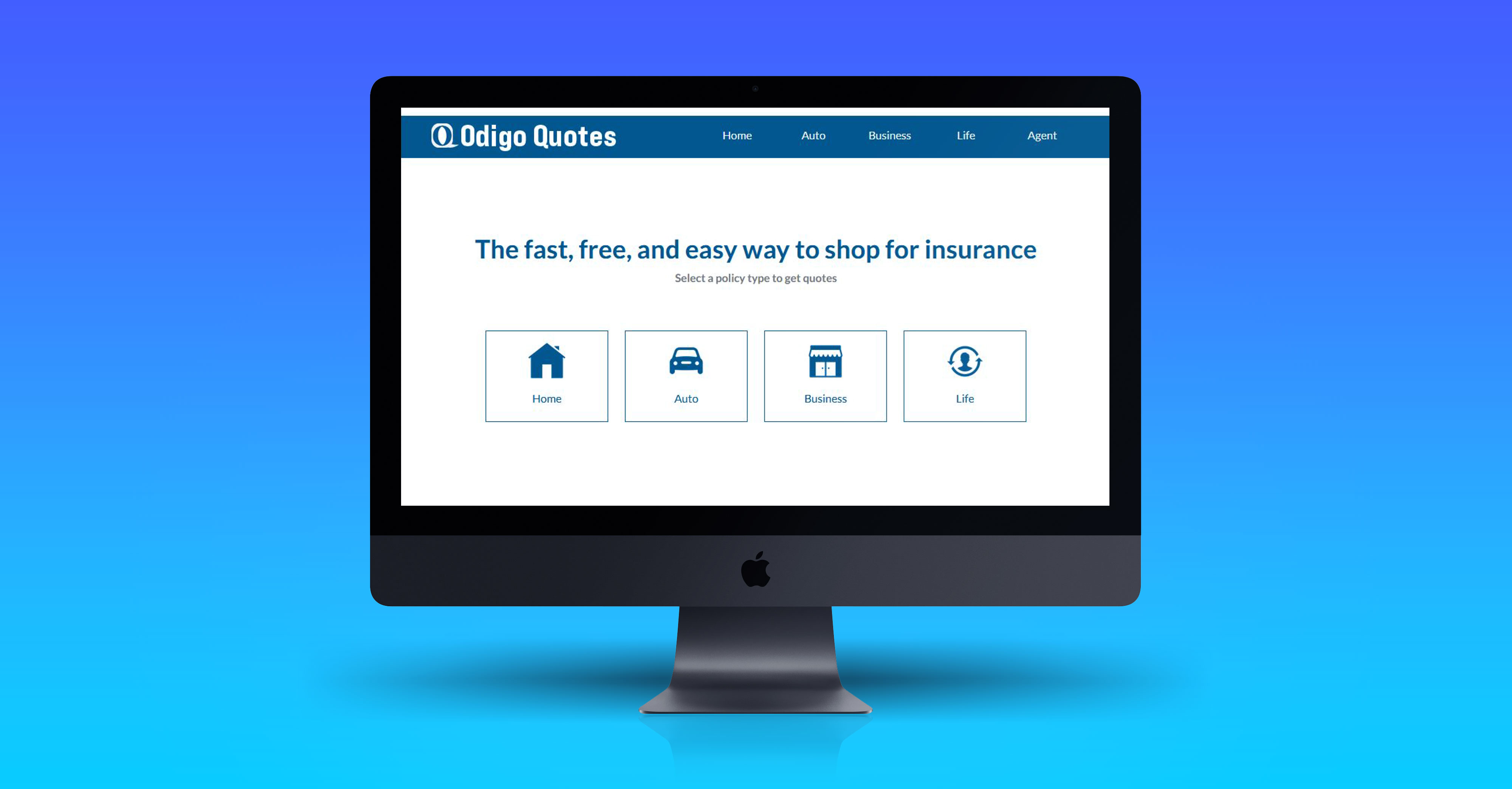
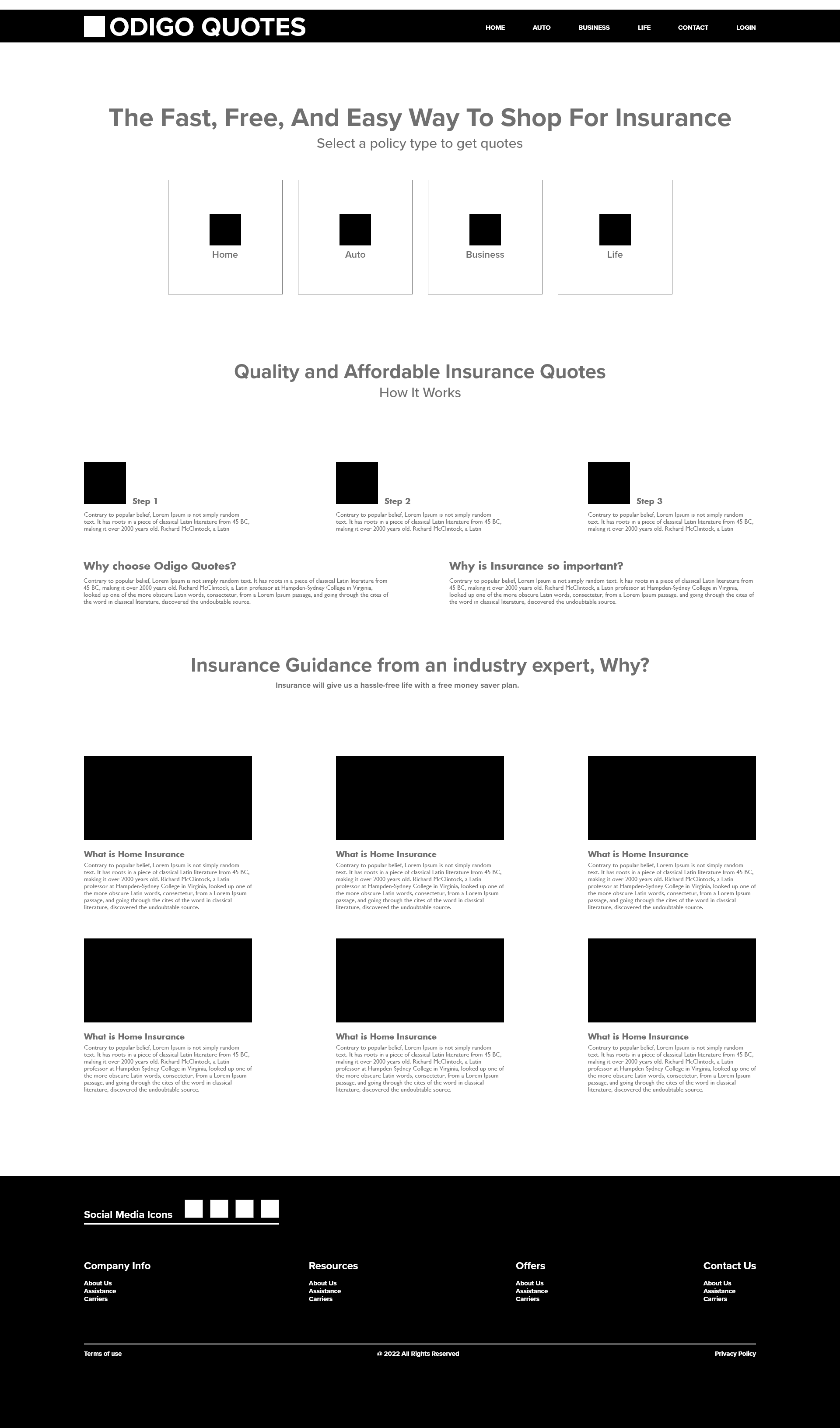
Wireframe-Landing Page
Landing page wireframe, created with Adobe XD. This wireframe saved me a lot of time and stress in the design process. It provided the best idea to stakeholders and helped me to conduct the second time user interview after the sketch review.
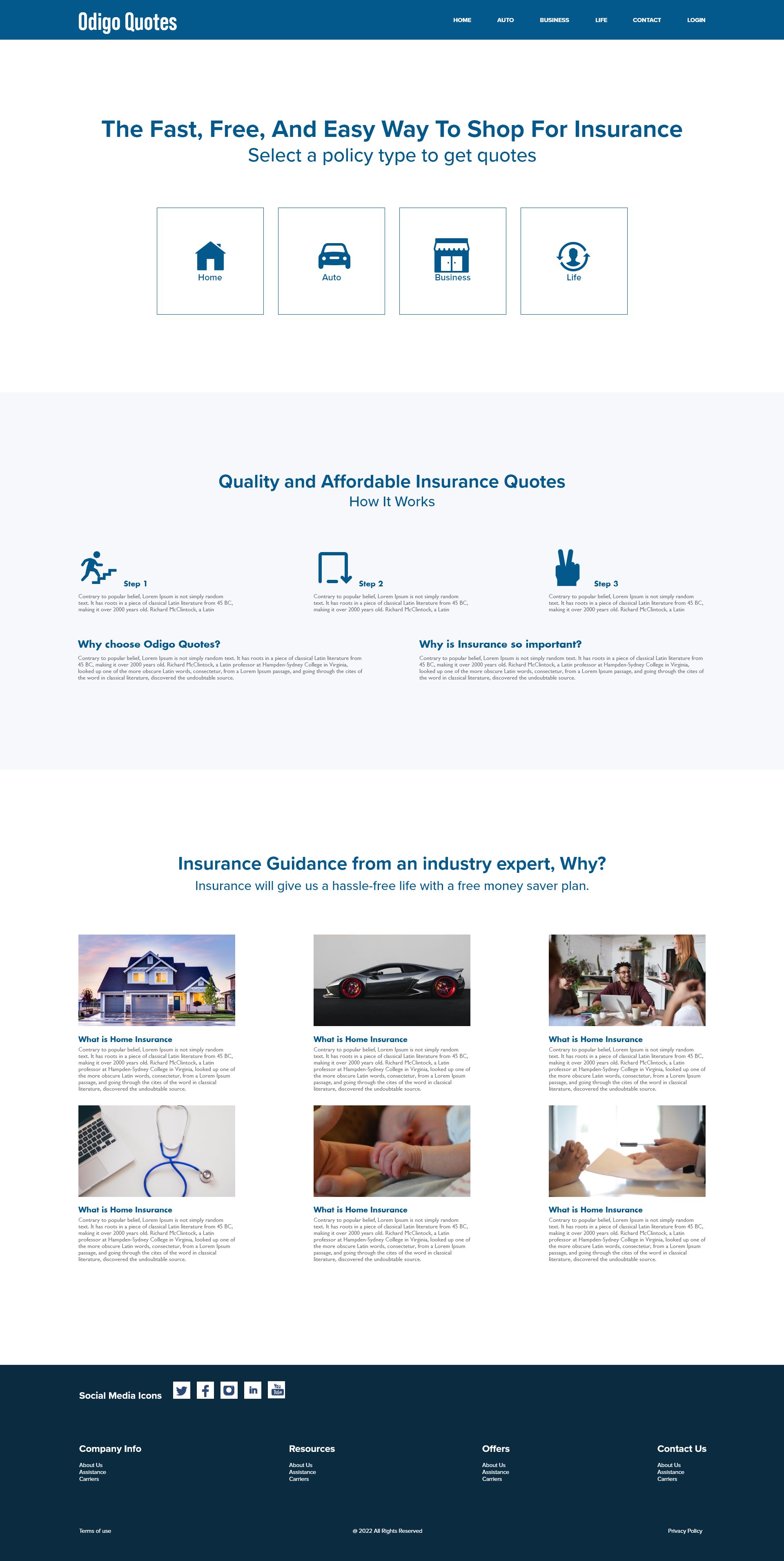
Prototype - Landing Page
The landing page mock-up, the key part of the project, it received the most relevant positive reviews from users. This prototype used to collect feedback from stakeholders and users to get the right design direction for the final product. When we completed the usability testing, it helped to understand the real problems with the product.
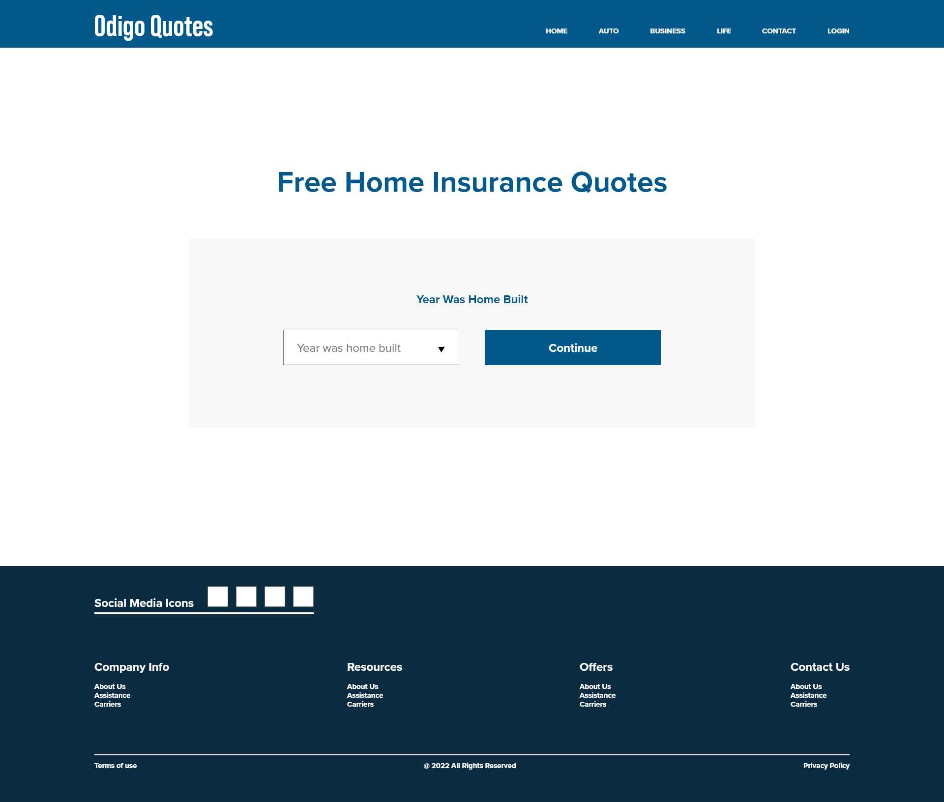
Wireframe-Free Home Quote Registration
Wireframe-Free Home Quote Registration page
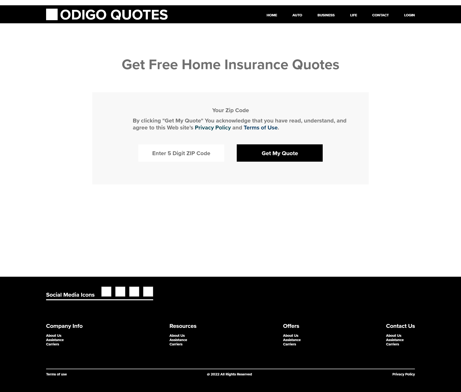
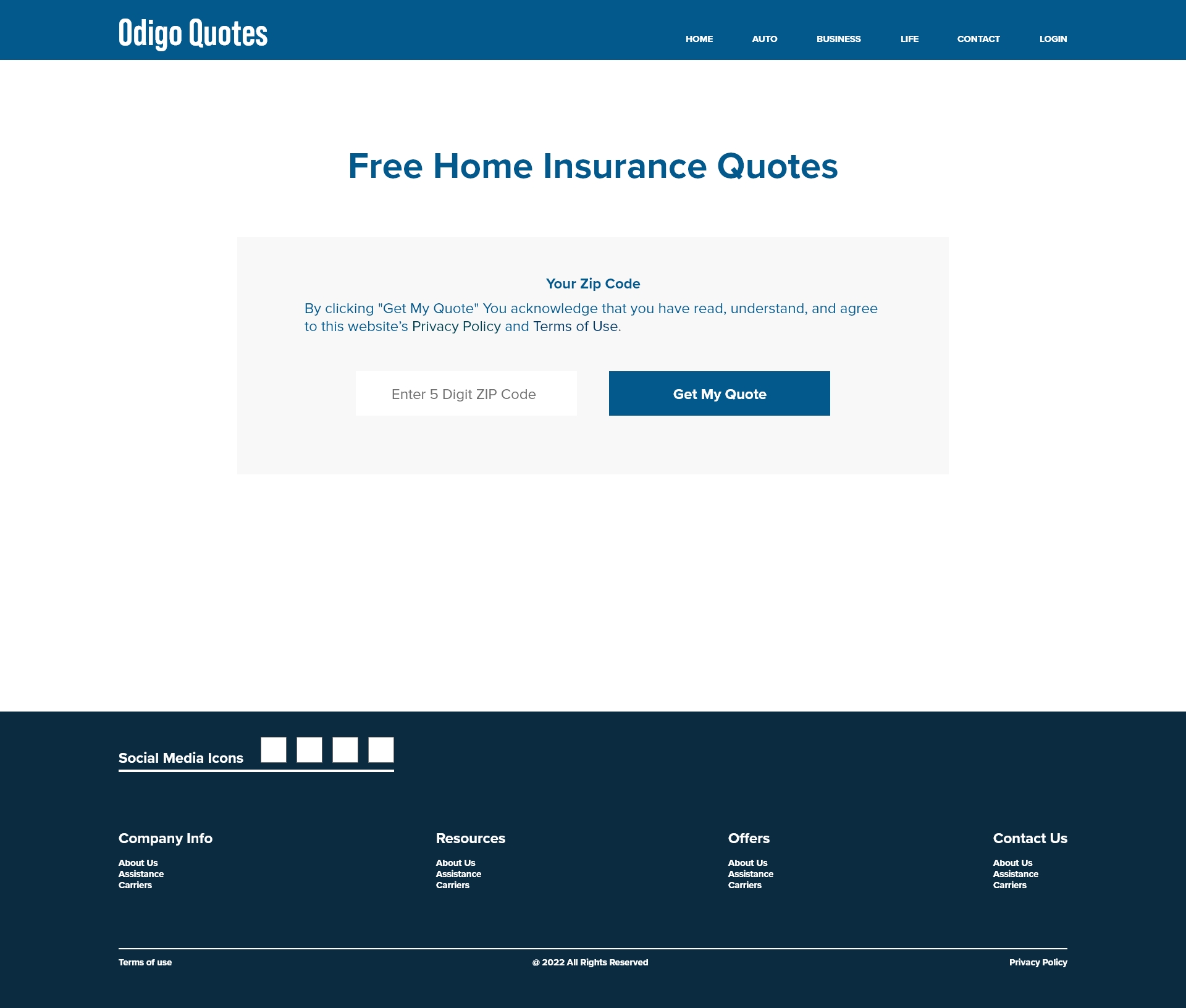
Prototype-Data Collection-Page
Prototype-Data Collection-Start page for the Free Home Quote. This page used to collect and identify the location with ZIP code entry.
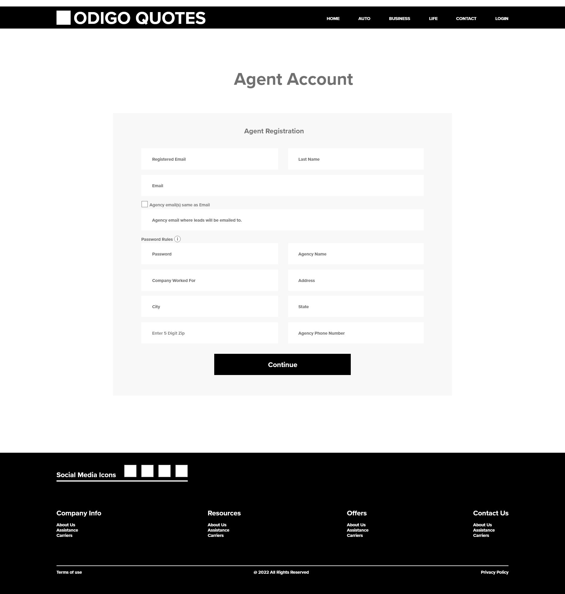
Agent Account Registration Page
Wireframe of the agent account registration page. Tools used to create Adobe XD. It created after the real user interview with the Sketch. It was very helpful for the presentations and meeting with our product design process cycle.
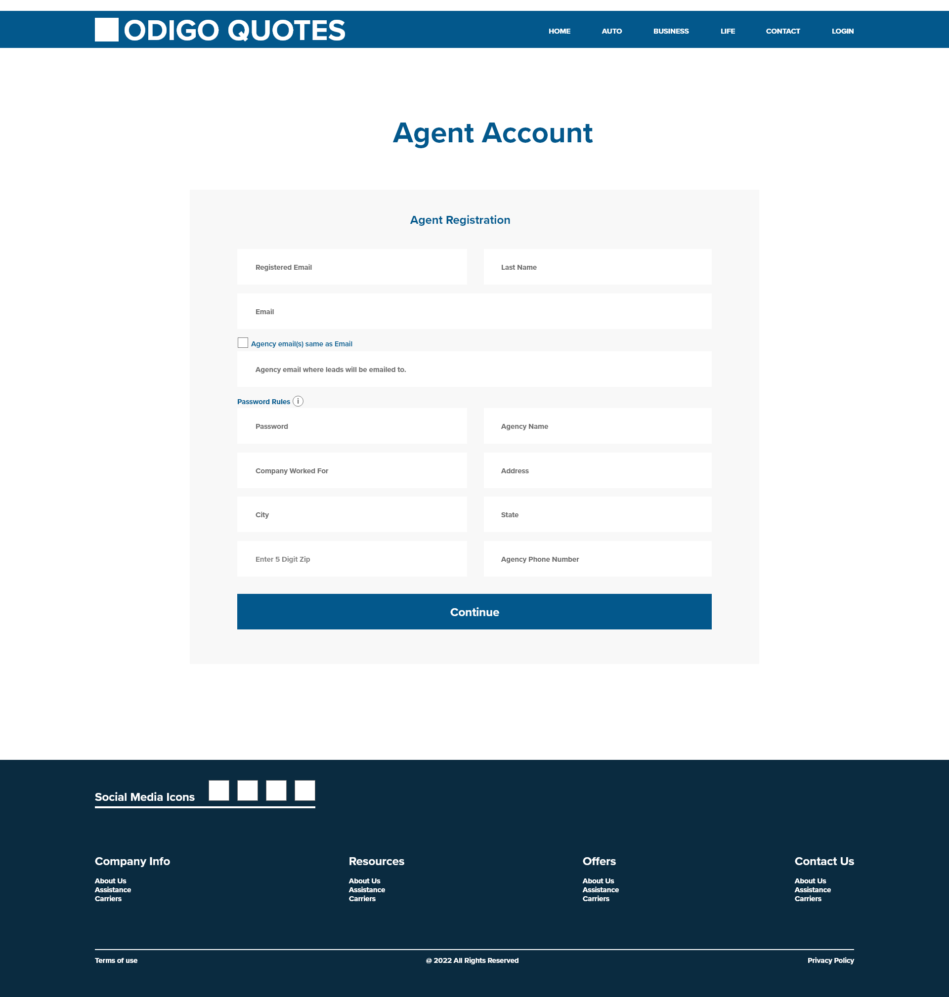
Prototype-Agent Registration
Prototype - agent registration page develped by Adobe XD.
Problem Previously Entered Data Edit
The early version, users can't do edit or check option they previously entered data. Users were unhappy with the bad user experience.
Problem - Solution
Decided to add a back button for previous page data edit. The back button provides a nice user experience for users.
Problem - Data Progress Status
In the previous version, users have no option to see what is the status of the data collection process and completion.
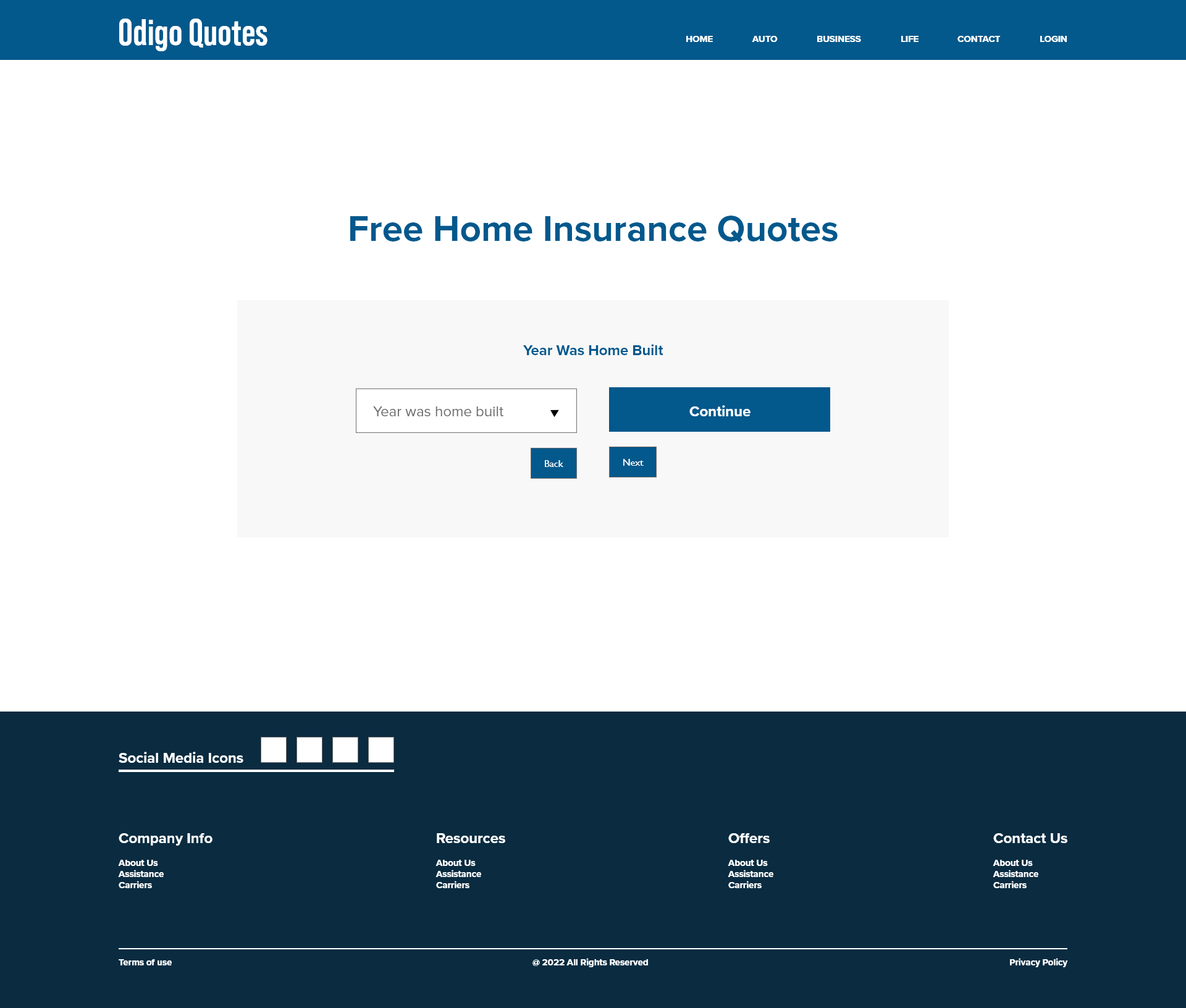
Problem - Solution - Progress Map
Here, added an option to the categorized data well organized by sections with a page progress bar and direct access to each section.
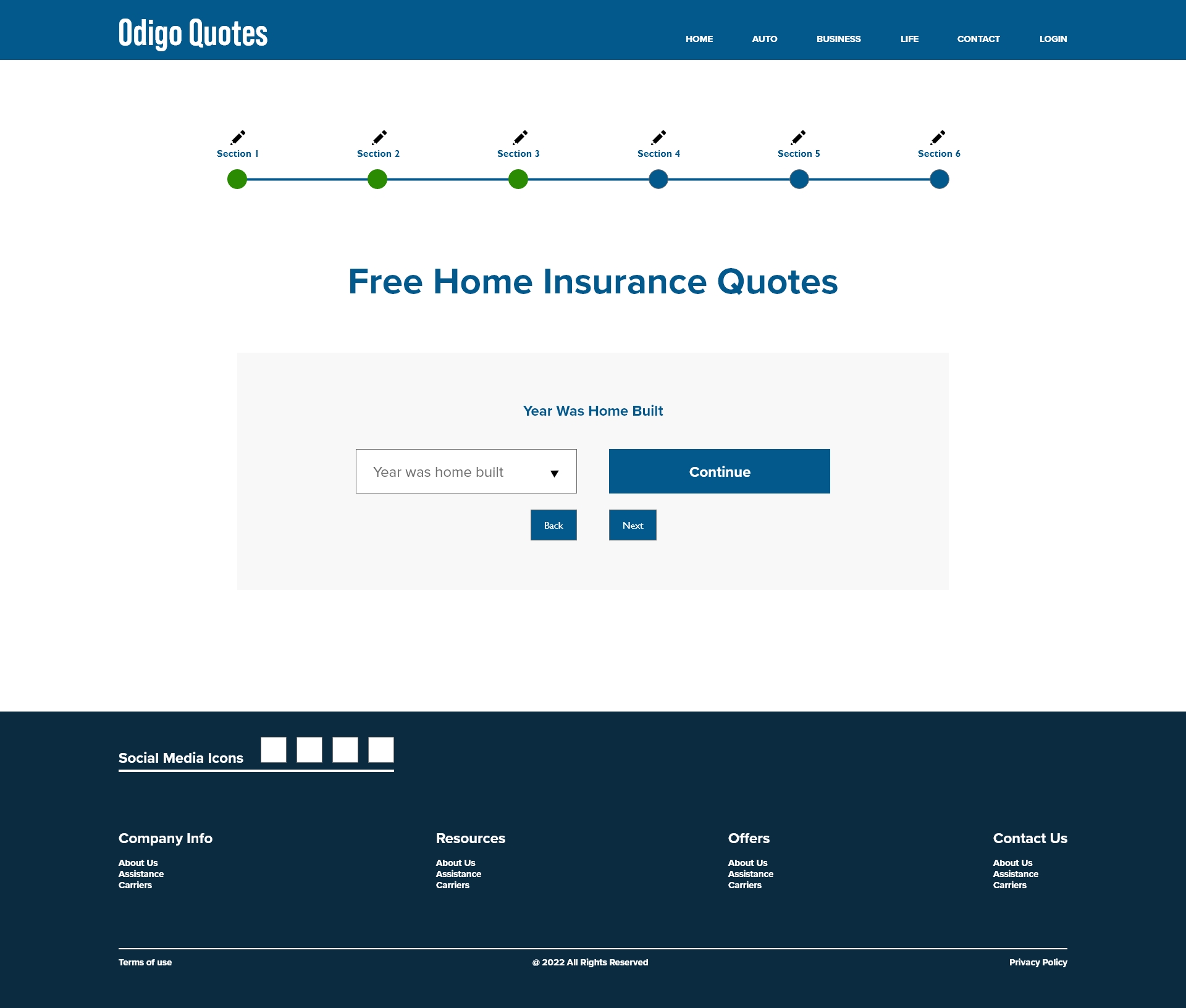
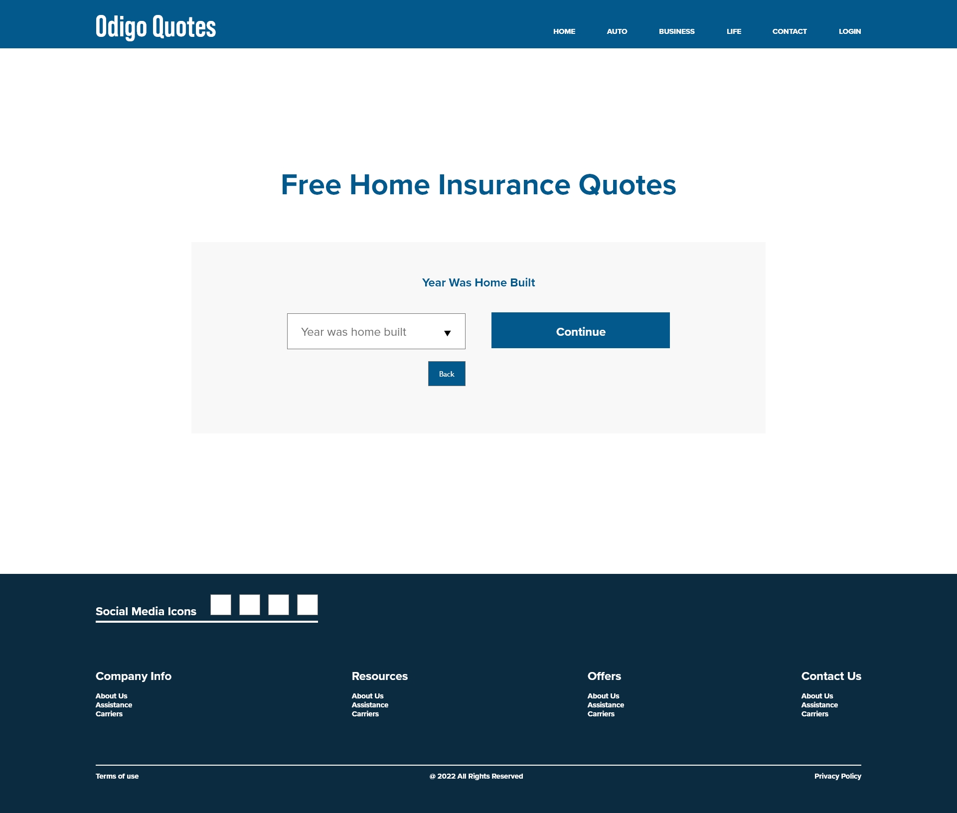
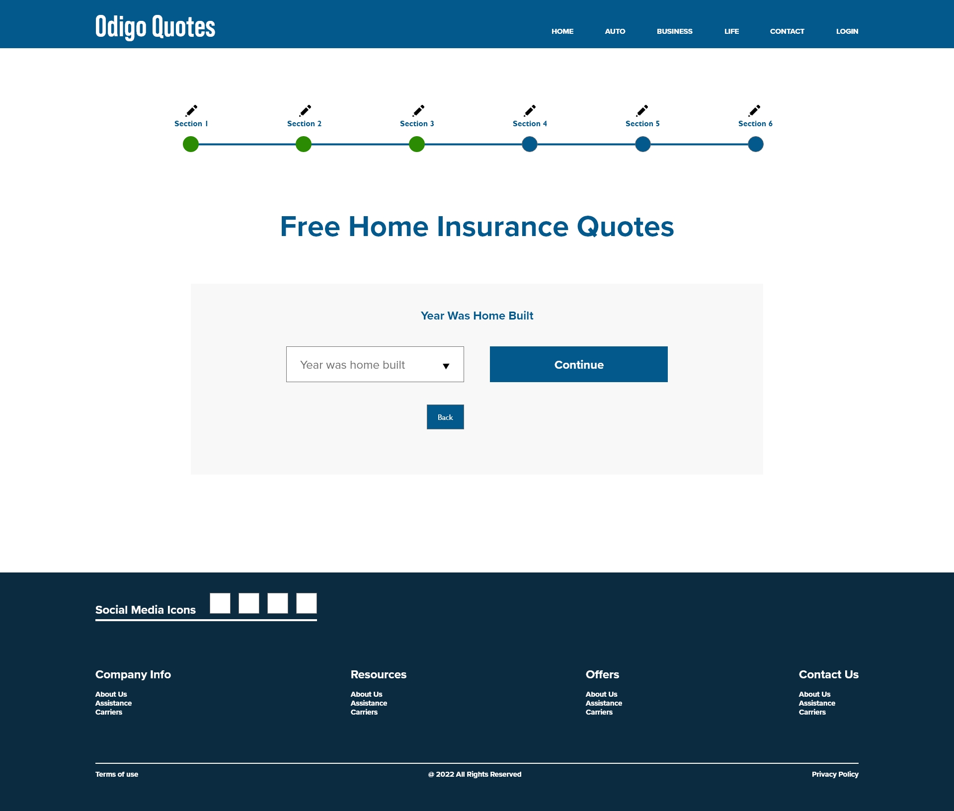
Back Button - No Next Button - Solution
There was an issue with next button. When users go back to edit data got confusion with nxt and continue buttons. Solved the issue always to continue or next use one button. It's 'continue' button.
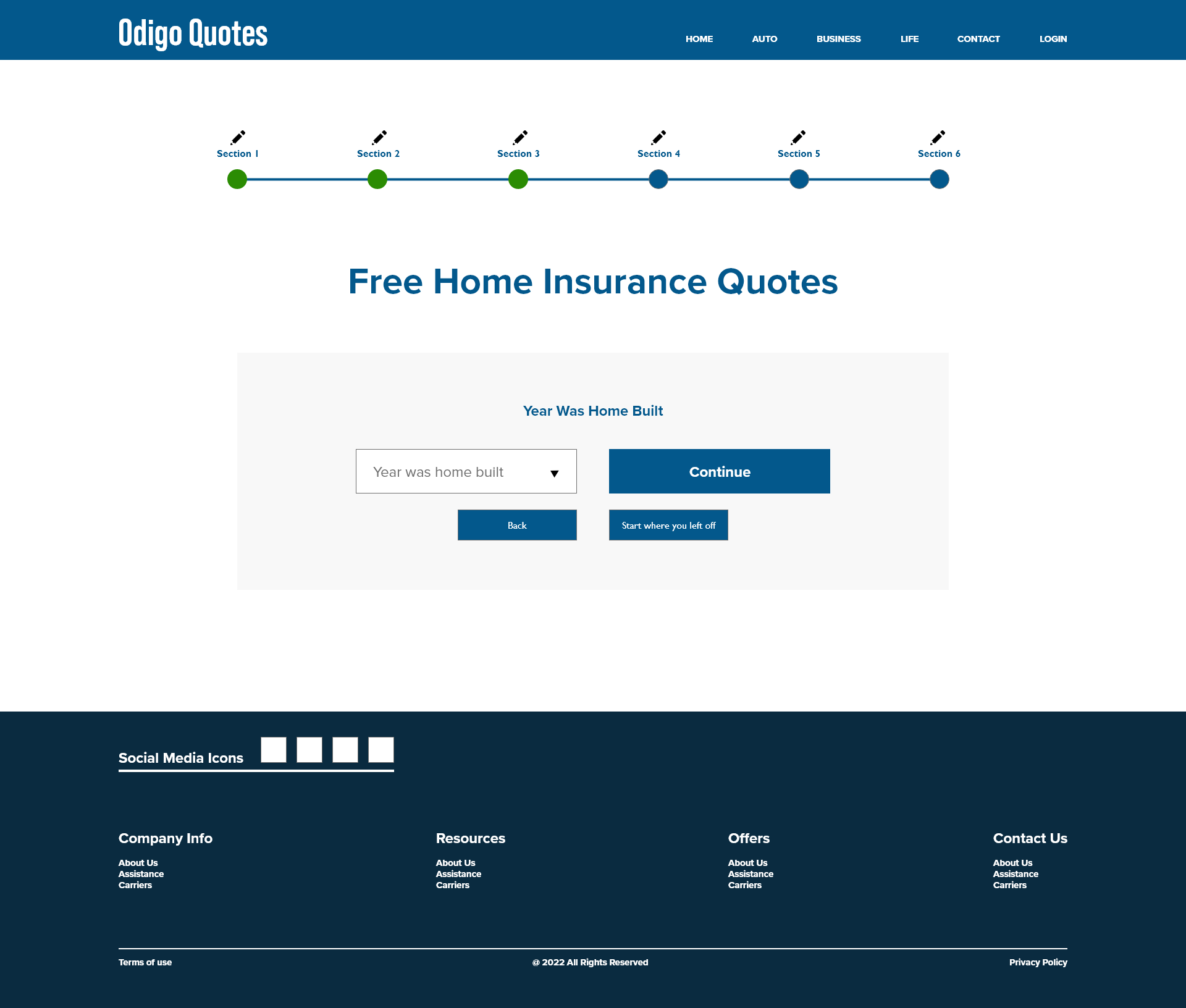
Start Where You Left Off
There was a issue facing back, next and continue. It confused users where they need to go for the next. It solved with a option button. The button can use of start where you left off. It helped a lot to solve the problem.
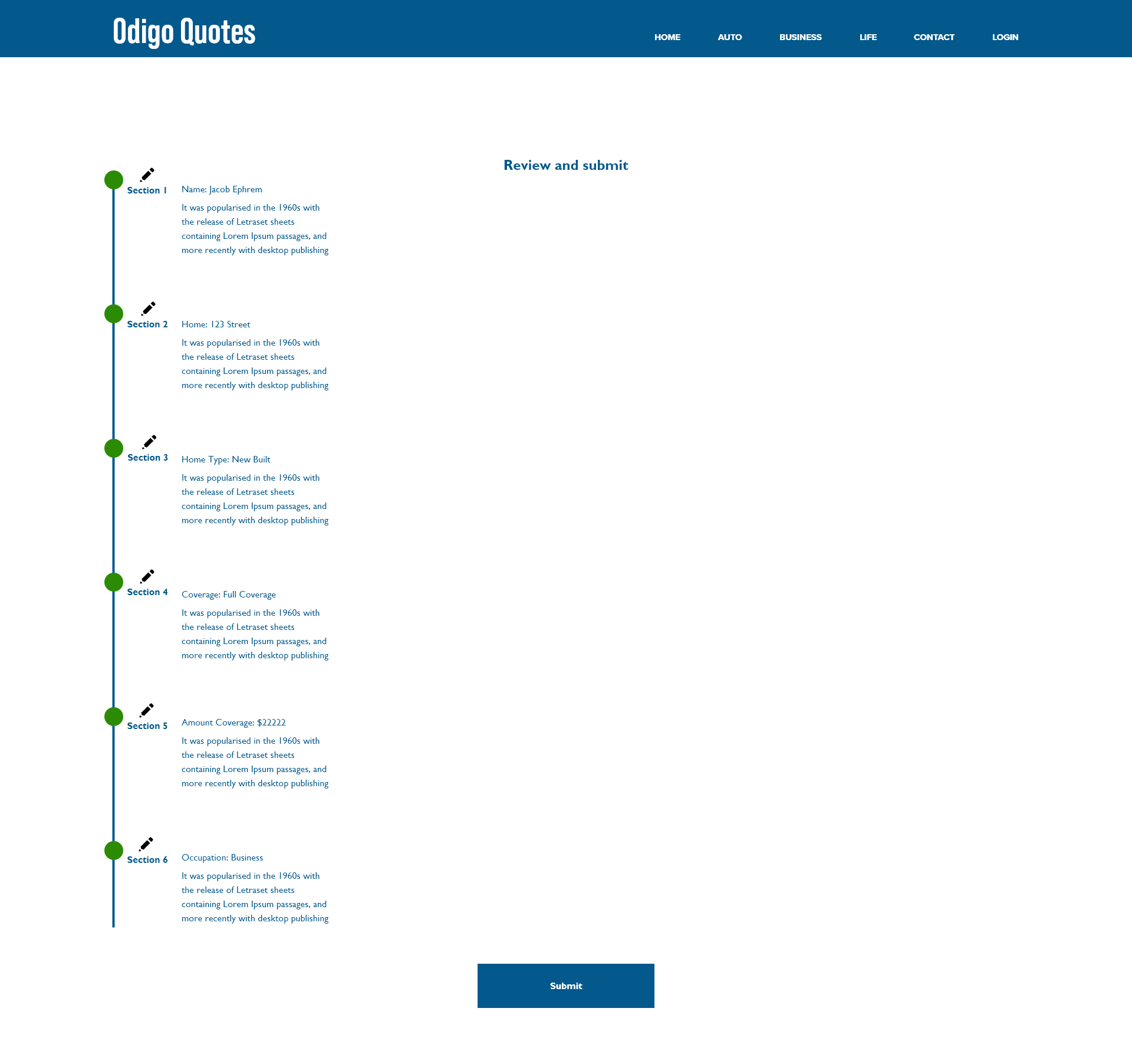
Review page & Submit
The main issue with this page was each section no edit option and progress bar. Also, the early version of the product there is no sections, edit options and no categorization in the data collection. Here, in this design data properly organized by sections with a progress bar. The review page added a new option to the full data edit control and submit. It will help users simply access previously entered data before submission to make corrections for the free insurance quote request.
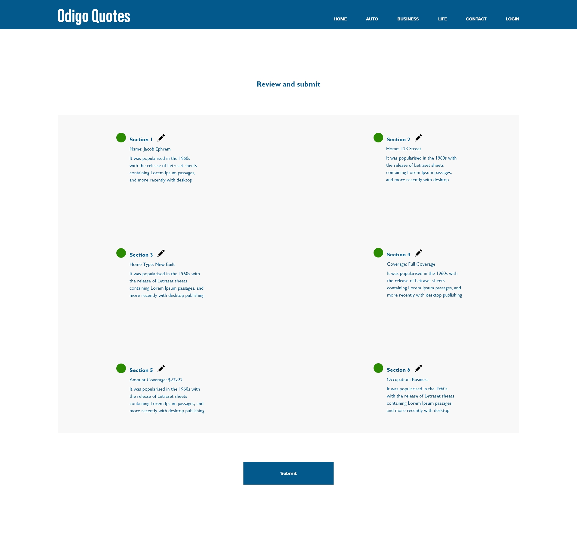
Review & Submit Option 2
I made a second option to review and submit the page. There was an issue with responsiveness, especially in mobile devices. It solved by these two options. Finally, selected the second option.
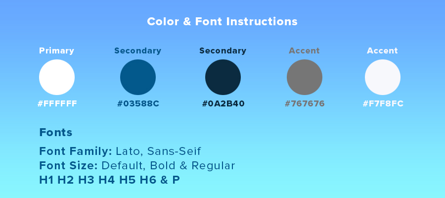
Color, Font & Font Family
A transparent design instructions for the development team in the process, these steps are quite important. It will make the result a better collaboration with teams and saving time.
The Result
The engineering team had instrumented lot of areas in the application to measure the business KPIs with which I was able to measure some of the UX design KPIs.
One of the main observations, we as a team made was that the TSR (Task Success Rate) were very high (almost 80%) when compared to our previous version of the application. The task success rate measures the number of tasks completed successfully over the total number of attempts.
Another KPI that we measured was the Time-on-task which calculates the time it takes the user to finish the task for providing the information, then the time at which it gets assigned to an insurance agent. We have seen that the common time to finish the task reduced from 30 mins to 5 mins compared to the previous application and the time to assign the leaf to the agent reduced from 2 mins to 500ms.
Navigation elements tracked the way the user was navigating within the application and we found that there is a requirement for having a progress bar for the overall navigation of the web application. It was decided that this will be implemented in the next version of the application.
As mentioned in the project summary, the main reason for the uplifting of this application was to reduce the user error rate while collecting the information and when assigning the leaf to the subscriber. The user error rate (UER) is the number of times a user makes a wrong entry. The higher the UER score, the higher the number of usability problems. We reduced the UER by having client validations which reduced the unforeseen errors.
The attitudinal UX KPIs that we have measured are System Usability Scale (SUS), Net Promoter Score (NPS) and the Customer satisfaction (CSAT). The SUS score came to about 79%. NPS illustrates customer satisfaction and loyalty and is calculated by (Number of promoters-number of detractor)/ (Number of respondents) * 100 and it came to be about 30%. We have measured the CSAT score which is measured by the (Number of satisfied customers) / Number of respondents X 100 and it came to about 54%.
Live working progress link: https://odigoquotes.com/index1.php